Examples
Monthly temperature across Australia
The National Oceanic and Atmospheric Administration (NOAA) provides
comprehensive weather data from numerous stations across Australia. The
aus_temp dataset includes key climate variables, such as
precipitation and temperature, recorded at 29 different weather stations
throughout 2020.
head(aus_temp) |>
kable() |> kable_styling()| id | long | lat | month | tmin | tmax | prcp |
|---|---|---|---|---|---|---|
| ASN00001020 | 126.3867 | -14.09 | 1 | 253.4516 | 319.0000 | 163.87097 |
| ASN00001020 | 126.3867 | -14.09 | 2 | 248.6786 | 322.6071 | 162.74074 |
| ASN00001020 | 126.3867 | -14.09 | 3 | 253.6129 | 333.1935 | 42.00000 |
| ASN00001020 | 126.3867 | -14.09 | 4 | 244.0357 | 340.9310 | 21.57143 |
| ASN00001020 | 126.3867 | -14.09 | 5 | 220.4138 | 331.9333 | 0.00000 |
| ASN00001020 | 126.3867 | -14.09 | 6 | 202.3667 | 310.9000 | 11.20000 |
Using the default rescaling parameters, we can visualize the
temperature data through geom_glyph_segment(), alongside
geom_point() elements that mark the location of each
weather station. Each segment glyph represents local climate data,
offering an intuitive way to explore temperature variations across
Australia.
The default identity scaling function is applied to each
set of minor values within a grid cell. This method centers the glyphs
both vertically and horizontally based on the station’s coordinates and
adjusts the minor axes to fit within the interval [-1, 1]. This ensures
that the glyphs are appropriately sized to fit the desired dimensions.
In this example, we will also be specifying the size of the glyph by
specifying the size of the width and height of the glyph.
aus_temp |>
  ggplot(aes(
    x_major = long,
    y_major = lat,
    x_minor = month,
    y_minor = tmin,
    yend_minor = tmax)) +
  geom_sf(data = abs_ste, fill = "antiquewhite",
          inherit.aes = FALSE, color = "white") +
  coord_sf(xlim = c(110,155)) +
  # Add glyph box to each glyph
  add_glyph_boxes( width = 3, height = 2) +
  # Add points for weather station
  geom_point(aes(x = long, y = lat,
                 color = "Weather Station")) +
  # Customize the size of each glyph box using the width and height parameters.
  geom_glyph_segment(
    width = 3, height = 2,
    aes(color = "Temperature")) +
  # Theme and aesthetic
  scale_color_manual(
    values = c("Weather Station" = "firebrick",
               "Temperature" = "black")) +
  labs(color = "Data",
       title = "Daily Temperature Variations Across Australian Weather Stations")  +
  theme_glyph()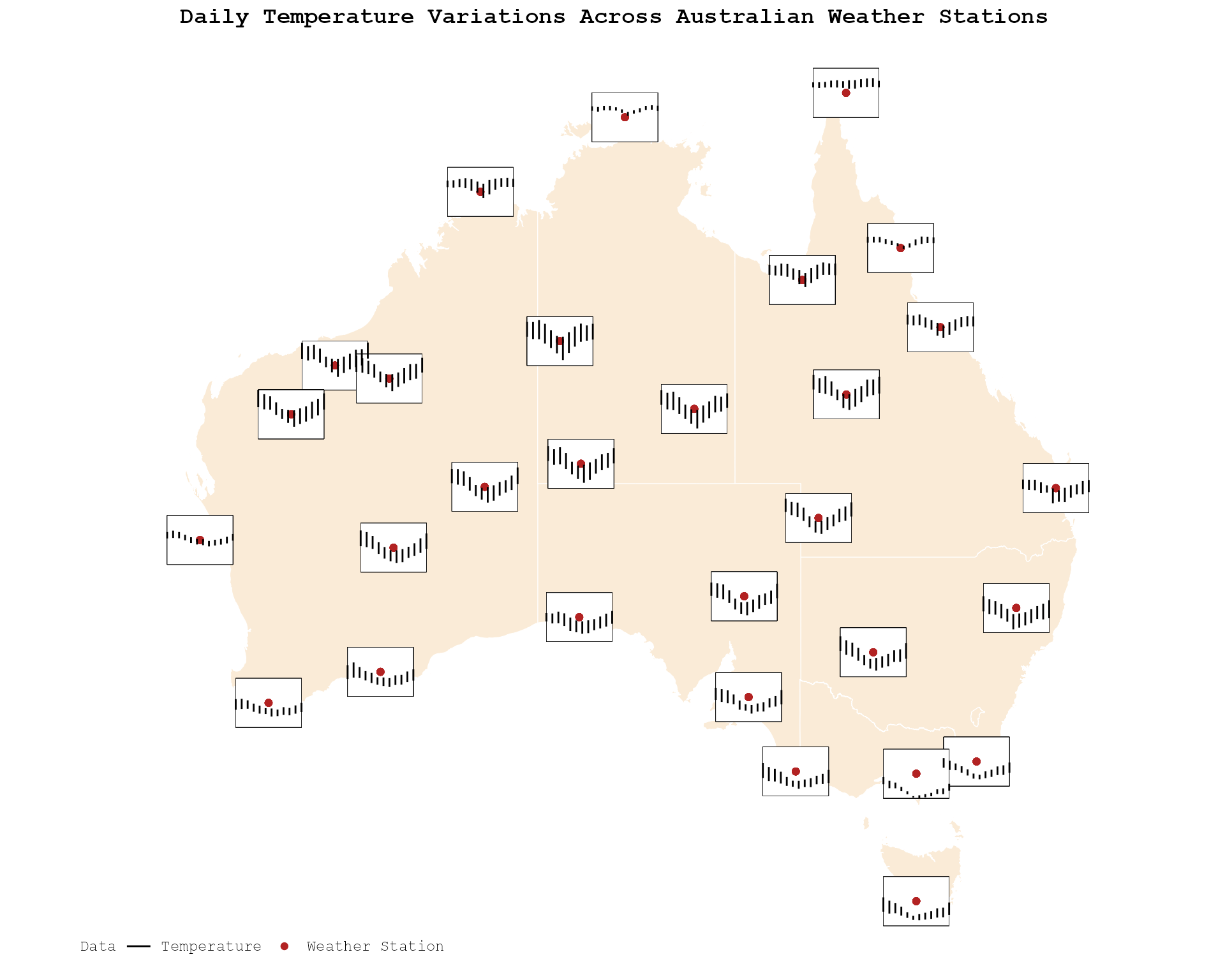
By disabling global rescaling, we can see the effects of local rescaling, where each glyph is resized based on its individual values. - Local Rescale (global_rescale = FALSE): Each line segment’s length is determined by the local temperature range within a region, emphasizing regional differences in temperature patterns. - Global Rescale (global_rescale = TRUE): Global temperature range determined the length of each line segment, ensuring that data range remain consistent across all region for easy comparison.
Below is a comparison of the two rescaling approaches. In this example, we also specify the size of the glyphs by setting width = 3 and height = 2.
# Global rescale
p1 <- aus_temp |>
  ggplot(aes(
    x_major = long,
    y_major = lat,
    x_minor = month,
    y_minor = tmin,
    yend_minor = tmax)) +
  geom_sf(data = abs_ste, fill = "antiquewhite",
          inherit.aes = FALSE, color = "white") +
  coord_sf(xlim = c(110,155)) +
  # Add glyph box to each glyph
  add_glyph_boxes(width = 3, height = 2) +
  # Add reference lines to each glyph
  add_ref_lines(width = 3, height = 2) +
  # Glyph segment plot with global rescale
  geom_glyph_segment(global_rescale = TRUE,
                     width = 3, height = 2) +
  labs(title = "Global Rescale") +
  theme_glyph()

# Local Rescale
p2 <- aus_temp |>
  ggplot(aes(
    x_major = long,
    y_major = lat,
    x_minor = month,
    y_minor = tmin,
    yend_minor = tmax)) +
  geom_sf(data = abs_ste, fill = "antiquewhite",
          inherit.aes = FALSE, color = "white") +
  coord_sf(xlim = c(110,155)) +
  # Add glyph box to each glyph
  add_glyph_boxes(width = 3, height = 2) +
  # Add reference lines to each glyph
  add_ref_lines(width = 3, height = 2) +
  # Glyph segment plot with local rescale
  geom_glyph_segment(global_rescale = FALSE,
                     width = 3, height = 2) +
  labs(title = "Local Rescale") +
  theme_glyph()

grid.arrange(p1, p2, ncol = 2) 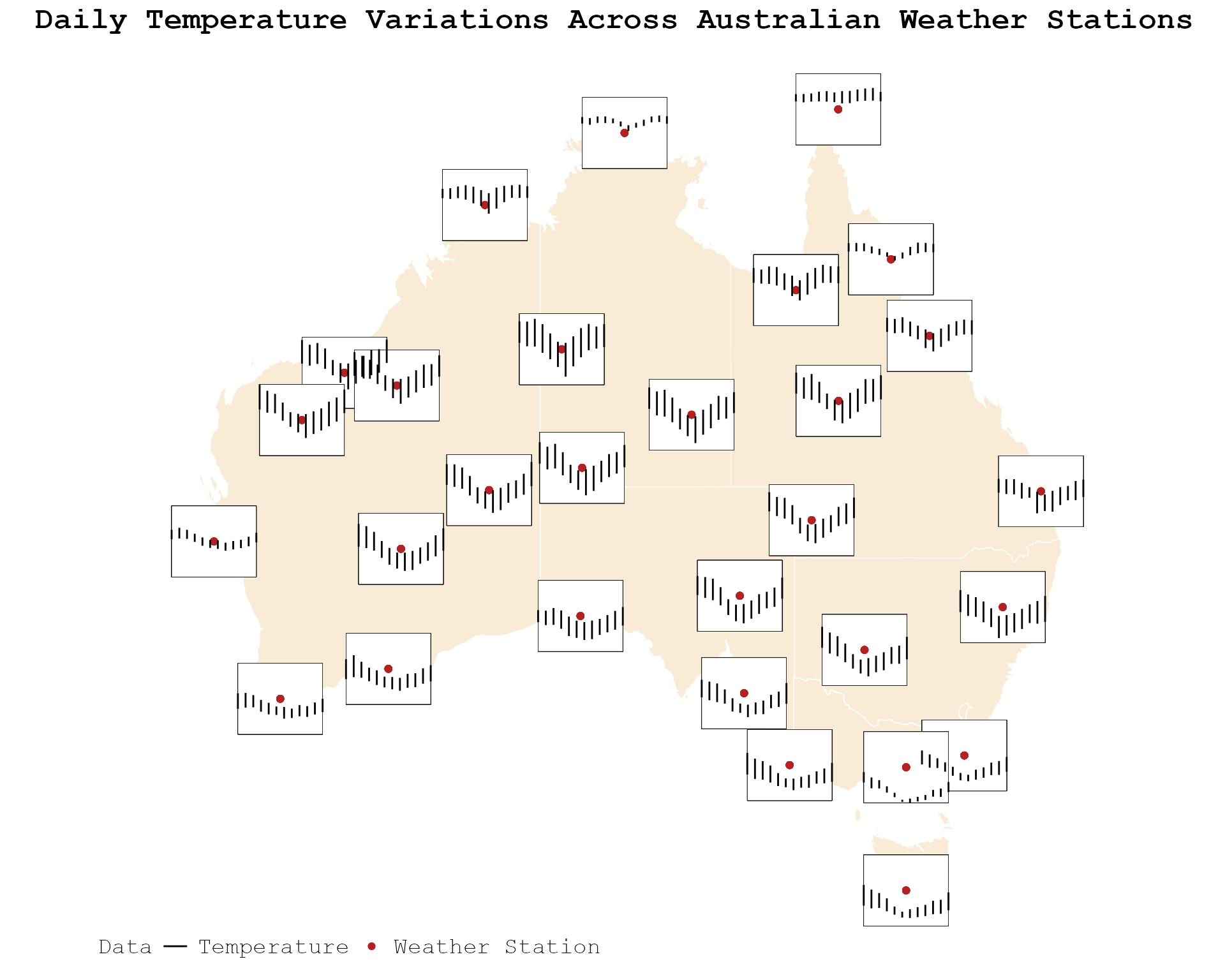
Highlighting Temperature Changes with Color-Coded Glyph
Expanding on our temperature analysis, we now incorporate
precipitation data across Australia using
geom_glyph_ribbon(). The glyphs are color-coded to
represent varying levels of rainfall, with reference lines and glyph
boxes enhancing clarity and allow for easy comparison of precipitation
level across the country.
aus_temp |>
   group_by(id) |>
   mutate(prcp = mean(prcp, na.rm = TRUE)) |>
   ggplot(aes(x_major = long, y_major = lat,
              x_minor = month, ymin_minor = tmin,
              ymax_minor = tmax,
              fill = prcp, color = prcp)) +
  geom_sf(data = abs_ste, fill = "antiquewhite",
          inherit.aes = FALSE, color = "white") +
  # Add glyph box to each glyph
   add_glyph_boxes() +
  # Add ref line to each glyph
   add_ref_lines() +
  # Add glyph ribbon plots
   geom_glyph_ribbon() +
   coord_sf(xlim = c(112,155)) +
  # Theme and aesthetic
  theme_glyph() +
  scale_fill_gradientn(colors = c("#ADD8E6", "#2b5e82", "dodgerblue4")) +
  scale_color_gradientn(colors = c( "#ADD8E6", "#2b5e82", "dodgerblue4")) +
  labs(fill = "Percepitation", color = "Percepitation",
title = "Precipitation and Temperature Ranges Across Australia") 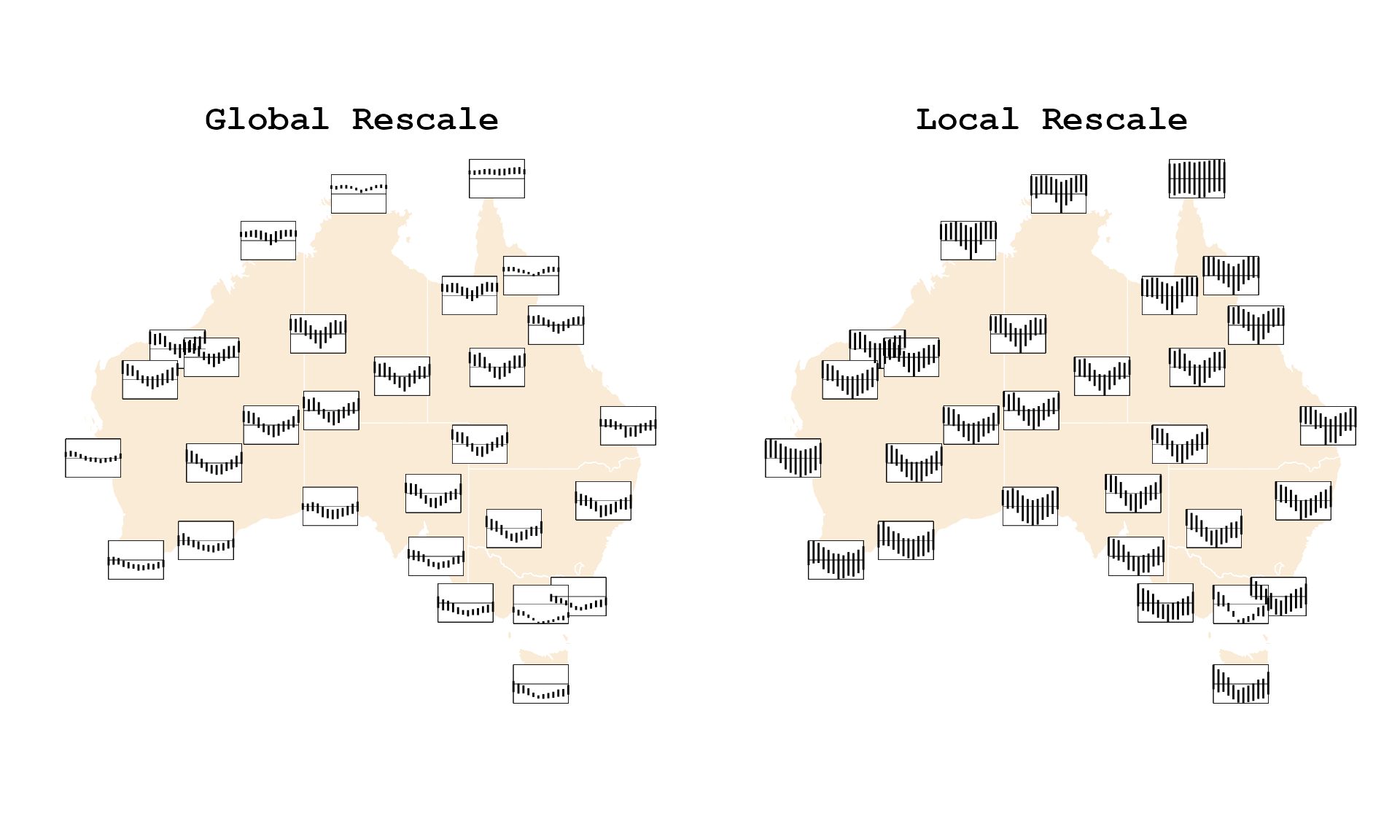
If you’re interested in comparing temperature trends across different
years for specific regions in Victoria, geom_glyph_ribbon()
provides a way to visualize how temperatures have evolved over time,
with each year distinguished by a different color for clarity.
historical_temp |>
  filter(id %in% c("ASN00026021", "ASN00085291", "ASN00084143")) |>
   ggplot(aes(color = factor(year), fill = factor(year),
              group = interaction(year,id),
              x_major = long, y_major = lat,
              x_minor = month, ymin_minor = tmin,
              ymax_minor = tmax)) +
  geom_sf(data = abs_ste |> filter(NAME == "Victoria"),
           fill = "antiquewhite", color = "white",
          inherit.aes = FALSE)  +
  # Customized the dimension of each glyph with `width` and `height` parameters
   add_glyph_boxes(width = rel(2),
                   height = rel(1.5)) +
   add_ref_lines(width = rel(2),
                 height = rel(1.5)) +
   geom_glyph_ribbon(alpha = 0.5,
                     width = rel(2),
                     height = rel(1.5)) +
  labs(x = "Longitude", y = "Latitude",
       color = "year", fill = "year",
       title = "Temperature Trends in Selected Victorian Weather Stations") +
  # Theme and aesthetic
  theme_glyph() +
  theme(legend.position.inside = c(.4,0)) +
  scale_colour_wsj("colors6") +
scale_fill_wsj("colors6") 
Integrating Glyph Legends
To further enhance map readability, the
add_geom_legend() function integrates a larger version of
one of the glyphs into the bottom left corner of the plot. This legend
helps users interpret the scale of the data.
In the example below, a series of glyph are created using
geom_glyph_ribbon() and overlaid on a base map to depict
daily temperature variations across Australian weather stations. A
legend is added through add_glyph_legend(), allowing users
to easily interpret the range of daily temperature value based on a
randomly selected weather station. Since the legend data is drawn from a
single, randomly chosen station, it’s important for users to set a seed
for reproducibility to ensure consistent results.
set.seed(28493)
aus_temp |>
   ggplot(aes(x_major = long, y_major = lat,
              x_minor = month, ymin_minor = tmin,
              ymax_minor = tmax)) +
  geom_sf(data = abs_ste, fill = "antiquewhite",
          inherit.aes = FALSE, color = "white") +
  add_glyph_boxes(color = "#227B94") +
  add_ref_lines(color = "#227B94") +
  add_glyph_legend(color = "#227B94", fill = "#227B94") +
  # Add a ribbon legend
  geom_glyph_ribbon(color = "#227B94", fill = "#227B94") +
  theme_glyph()  +
labs(title = "Temperature Ranges Across Australia with Glyph Legend") 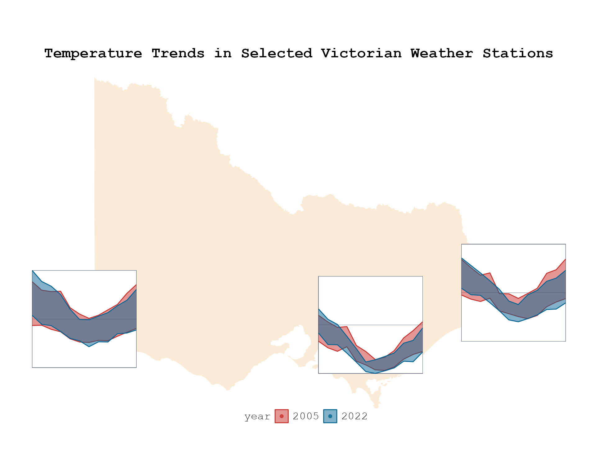
Observations and Insights
Both the Geom Glyph Segment and Geom Glyph Ribbon provide valuable insights into seasonal temperature trends across Australia. Disabling global rescaling reveals that most weather stations follow similar curvature trends relative to their neighboring stations. However, with global rescaling enabled, it becomes apparent that coastal regions exhibit far less temperature variation overall.