Overview
The sugarglider package extends the capabilities of
ggplot2 by introducing functions specifically designed for visualizing
seasonal patterns in spatio-temporal data. It includes
geom_glyph_ribbon() and geom_glyph_segment() ,
which represent measurements recorded over time at specific locations
through the use of glyph maps. These functions enable clear depictions
of seasonal trends by leveraging the combination of x_major and
y_major coordinates.
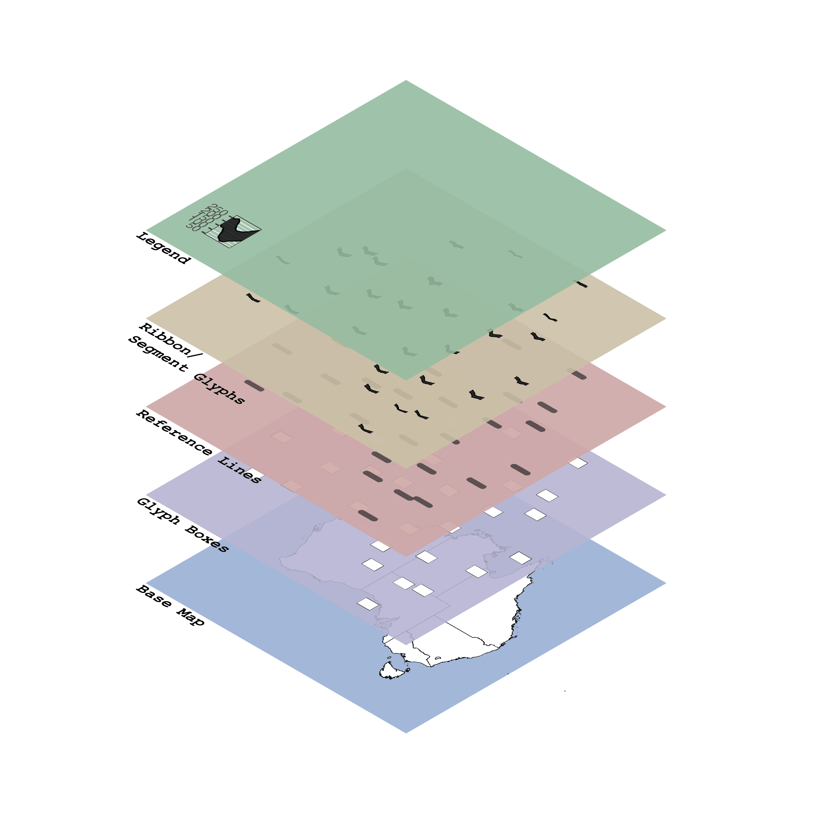
The structure of glyph maps in sugarglider consists of
four main layers: the base map, glyph boxes, reference lines, and ribbon
or segment glyphs. Additionally, users can create a legend, adding an
extra layer to the glyph maps. Apart from the base map, sugarglider
offers functionalities to generate all the elements of a comprehensive
glyph map, as illustrated in the figure below.
 Each
layer can be plotted independently, and the package supports the
creation of glyph plots using either ribbon or segment geometries. The
core functionality includes:
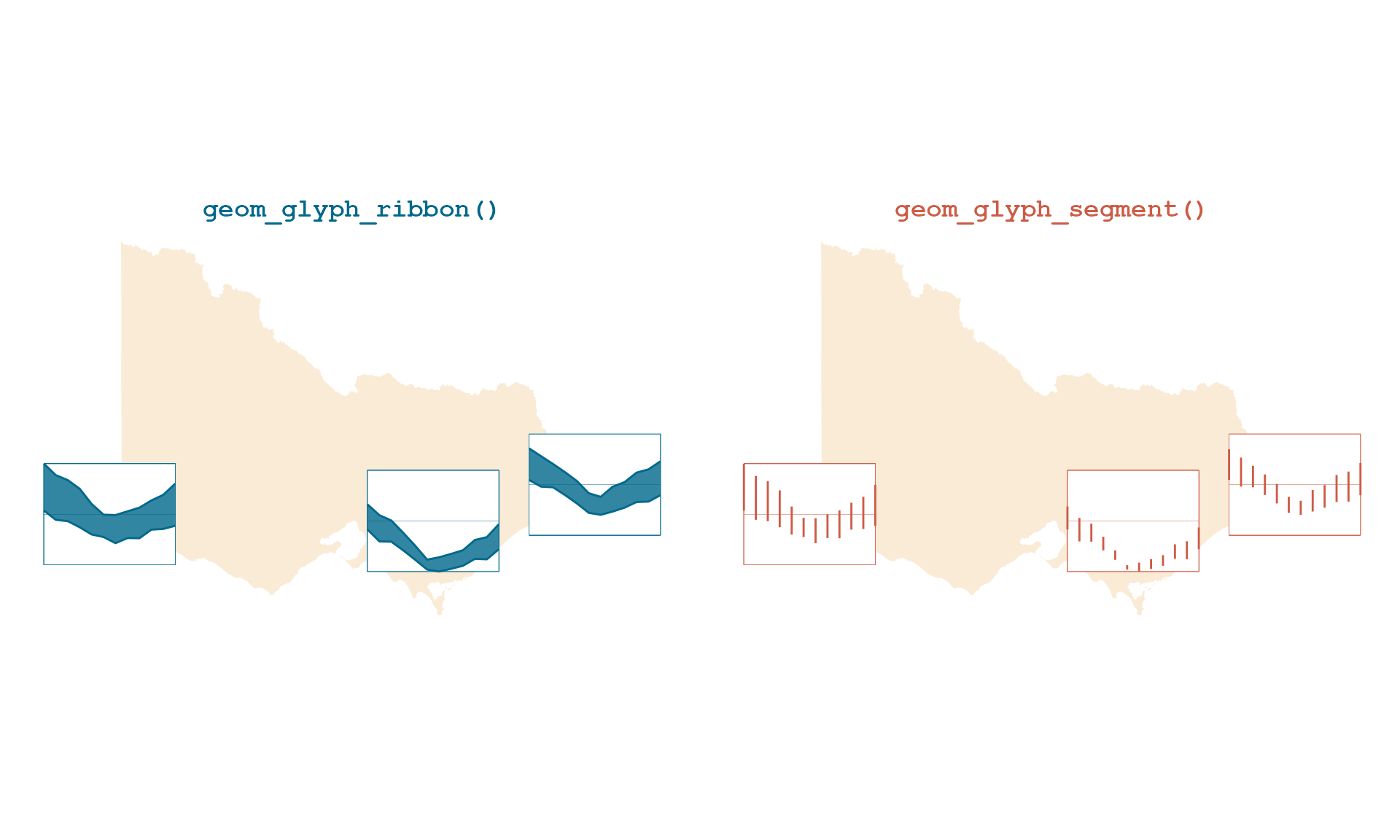
geom_glyph_ribbon(): Displays an interval on the y-axis for each x_minor value, with the bounds defined by ymin_minor and ymax_minor. This function draws ribbon geometry usinggeom_ribbon()fromggplot2to draw ribbon geometry, resulting in ribbon glyphs. Each glyph is plotted by combining x_major and y_major coordinates. This functionality is handy for visualizing ranges or uncertainties in the data.geom_glyph_segment(): Connects y_minor to yend_minor with a straight line usinggeom_segment()fromggplot2, resulting in segment glyphs. Each glyph is plotted by combining x_major and y_major coordinates.
vic_temp <- aus_temp |>
  filter(id %in% c("ASN00026021", "ASN00085291", "ASN00084143"))

# Define a color palette
color_palette <- c("deepskyblue4", "coral3")

p1 <- vic_temp |>
   ggplot(aes(x_major = long,
              y_major = lat,
              x_minor = month,
              ymin_minor = tmin,
              ymax_minor = tmax)) +
  geom_sf(data = abs_ste |> filter(NAME == "Victoria"),
          fill = "antiquewhite", color = "white", inherit.aes = FALSE)  +
  # Customize the size of each glyph box using the width and height parameters.
  add_glyph_boxes(color = color_palette[1]) +
  add_ref_lines(color = color_palette[1]) +
  geom_glyph_ribbon(color = color_palette[1], fill = color_palette[1]) +
  # Theme and aesthetic
  theme_glyph() +
  labs(title = "geom_glyph_ribbon()") +
  theme(plot.title = element_text(hjust = 0.5),
        title = element_text(color = color_palette[1],
                             family  = "mono"))

p2 <- vic_temp |>
   ggplot(aes(x_major = long,
              y_major = lat,
              x_minor = month,
              y_minor = tmin,
              yend_minor = tmax)) +
  geom_sf(data = abs_ste |> filter(NAME == "Victoria"),
         fill = "antiquewhite", color = "white", inherit.aes = FALSE)  +
  # Customize the size of each glyph box using the width and height parameters.
  add_glyph_boxes(color = color_palette[2]) +
  add_ref_lines(color = color_palette[2]) +
  geom_glyph_segment(color = color_palette[2]) +
  # Theme and aesthetic
  theme_glyph() +
  labs(title = "geom_glyph_segment()") +
  theme(plot.title = element_text(hjust = 0.5),
        title = element_text(color = color_palette[2]))

grid.arrange(p1, p2, ncol = 2) 
In addition to these two functions, sugarglider offers
several other features that enhance the aesthetic and interpretability
of glyph maps. The add_ref_box() function introduces
reference boxes that visually frame individual glyphs, helping to define
boundaries and distinguish glyphs from each other. The
add_ref_line() function draws a horizontal midpoint for
each glyph, facilitating comparisons across data points. The
add_glyph_legend() function allows users to display an
enlarged version of a randomly chosen glyph in the bottom-left corner of
the panel, enabling users to visualize the data range. Lastly, the
theme_glyph() function provides a customized theme for
glyph maps, built on top of theme_map() from
ggthemes. It adjusts the plot’s appearance, including the
legend position, text styles, and background settings, to create a
clean, visually consistent layout for glyph maps.
Aesthetics
The functions in sugarglider expect spatial coordinates
as the major axis and temporal data, along with some measurements, as
minor axes. For minor axes, sugarglider adopts the same
aesthetics as ggplot2::geom_ribbon() and
ggplot2::geom_segment(), but appends _minor to
each aesthetic name for use in geom_glyph_ribbon() and
geom_glyph_segment(). To incorporate a variable into the
glyph plot, it needs to be explicitly defined as an aesthetic.
To produce glyph-maps, the following aesthetics are required:
| Aesthetics | Description |
|---|---|
x_major,y_major
|
Spatial coordinates that define the position of glyphs. |
x_minor |
Represents temporal data associated with each glyph. |
ymin_minor, ymax_minor
|
Used by geom_glyph_ribbon() to establish the lower and
upper bounds of the ribbon geometry within each glyph. |
y_minor, yend_minor
|
Used by geom_glyph_segment() to set the start and end
points of the segment geometry within each glyph. |
The functions add_ref_box(),
add_ref_line(), and add_geom_legend() are
compatible with either ymin_minor, ymax_minor, or
y_minor, yend_minor. Additionally, sugarglider
introduces several customizable options to further tailor the visual
aspects:
| Option | Default | Description |
|---|---|---|
colour |
"black" |
Sets the color for line segments and borders. |
linewidth |
0.5 |
Specifies the width of the line for borders. |
linetype |
1 |
Defines the style of the line for borders. |
fill |
"black" |
Determines the color of the interior area of the geometries. |
alpha |
0.8 |
Controls the transparency level of the glyphs. |
Options
Options within the sugarglider package allow you to
tailor the behavior of your visualizations to meet the specific needs of
your analysis. The global_rescale argument provides control
over whether rescaling should occur globally across all data points or
be handled individually for each glyph.
sugarglider also offers a variety of customizable
features to enhance the flexibility and precision of visualizations. For
example, it facilitates the scaling of minor values within the glyph
along the x and y axes. Users can specify their rescale function by
replacing “identity” with a custom function in x_scale
and y_scale. Suppose a user wishes to modify the rescaling
function on only one axis. In that case, they can replace the value of
the corresponding parameter with their chosen function and retain
“identity” for the other. In this package, “identity” rescales the minor
axes to an interval of [-1,1]. The impact of rescaling on glyphs and its
implications for visual interpretation will be thoroughly discussed in
the upcoming section.
Additionally, the width and height of the glyphs are adjustable,
allowing users to modify the appearance of each glyph to match the
dimensions and scaling of the data being visualized. These customization
options ensure that sugarglider can adapt to a broad range
of data types and requirements, making it a versatile tool for seasonal
spatiotemporal data visualization.
| Option | Default | Description |
|---|---|---|
x_scale |
"identity" |
This function scales each set of minor values within a grid cell along the x-dimension. |
y_scale |
"identity" |
This function scales each set of minor values within a grid cell along the y-dimension. |
width |
default |
The width of each glyph. The default is set to the
smallest distance between two consecutive coordinates, converted from
meters to degrees of latitude using the Haversine method. |
height |
default |
The height of each glyph. The default is calculated
using the ratio (1:1.618) relative to the width, to
maintain a consistent aspect ratio. |
global_rescale |
TRUE |
Determines whether rescaling is applied globally across all glyphs or individually for each glyph. |
Interactivity
Interactive graphics are particularly useful when working with
spatio-temporal data as they allow users to explore the data from
multiple perspectives. The cubble package, exemplifies this
by creating linked interactive plots using
crosswalk::bscols(). In this vignette, we will demonstrate
how to create interactive glyph maps using Leaflet.
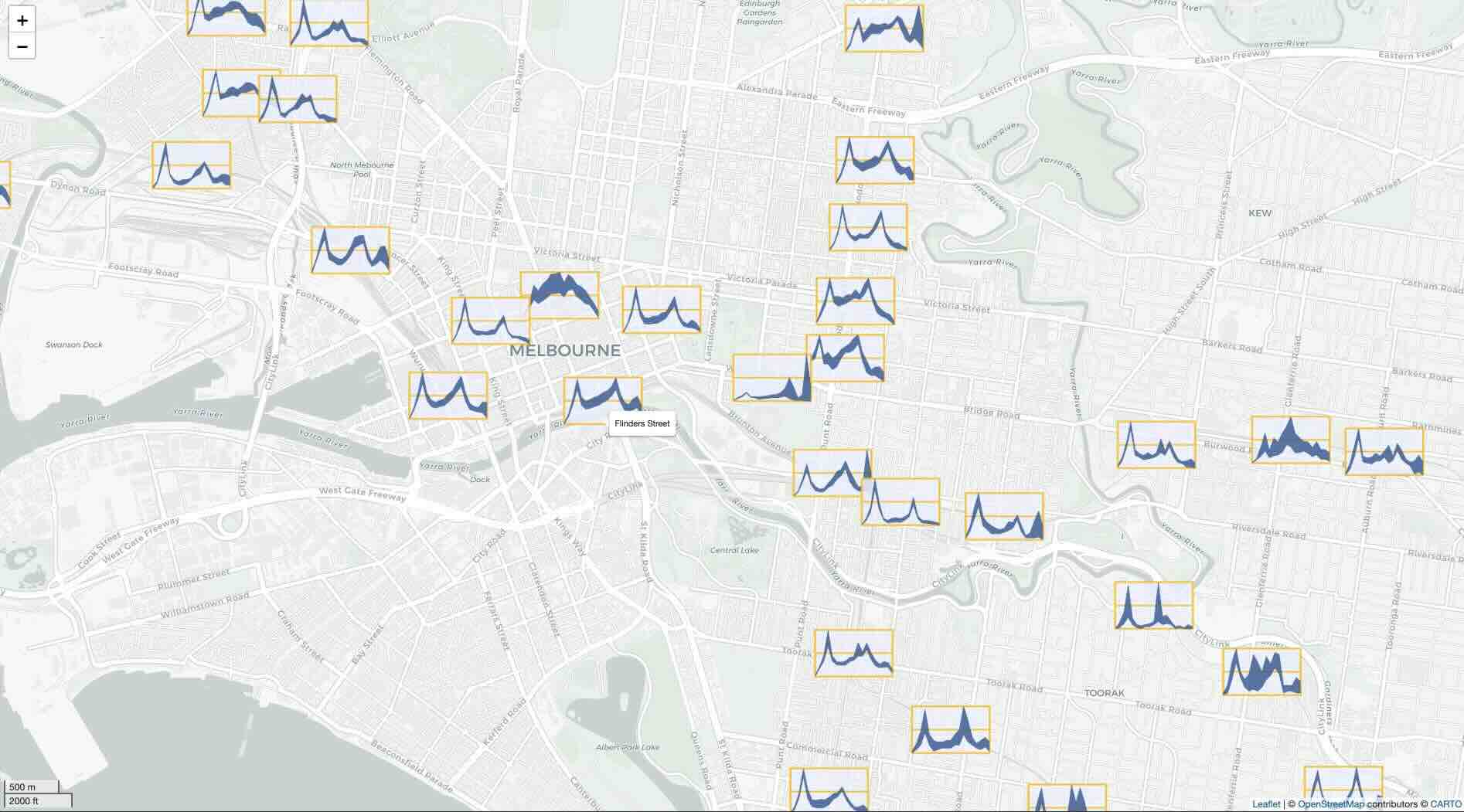
Create glyph maps with leaflet
The dataset used in this example, train, provides a
comprehensive monthly summary of daily patronage at each train station
in Victoria for the fiscal year 2023-2024. To create interactive glyph
maps with Leaflet, we first need to save each glyph as images and then
add these to the Leaflet basemap as icons. The process begins by
creating a list of all unique train stations that service both metro and
vline. We then iterate over each station and generate ribbon glyphs
using geom_glyph_ribbon(), add_glyph_boxes()
and add_ref_lines(). Each glyph is saved in PNG format, and
the file paths for all the images are stored in an object for the next
step.
# Generate a list of unique train stations
df_station <- train$station_name |> unique()

# Generate PNG of all the ribbon glyph
purrr::map(1:length(df_station), function(i) {
  dt <- train |> filter(station_name == df_station[i])
  p <- dt |>
  ggplot(aes(x_major = long, y_major = lat,
                   x_minor = hour, ymin_minor = min_weekday,
                   ymax_minor = max_weekday)) +
    add_glyph_boxes(color = "#ffc40d",
                    fill = "#eff4ff", alpha = 0.5,
                    linewidth = 1, width = 3, height  = 1.5) +
    add_ref_lines(color = "#ffc40d", alpha = 1,
                  linewidth = 1, width = 3, height  = 1.5) +
    geom_glyph_ribbon(color = "#2b5797", fill = "#2b5797",
                      width = 3, height  = 1.5) +
    theme_void()

  file_path <- paste0("figures/glyph_", df_station[i], ".png")
  ggsave(file_path, plot = p, width = 3, height = 2, units = "in", dpi = 300,
         bg = "transparent")
  return(file_path)

  }) -> train_png
To create the base map for Leaflet, we use the leaflet()
function and addProviderTiles() with CartoDB.Positron as
the provider to achieve a light, grey map aesthetic. Additionally, a
scale bar is added at the bottom left corner for reference.
# Create a leaflet map
leaflet_map <- leaflet() |>
  addProviderTiles("CartoDB.Positron") |>
  addScaleBar(position = "bottomleft")
Next, we iterate through all the images and convert them into icons
using the makeIcon() function. Users can control the
dimensions of each icon by modifying the iconWidth and
iconHeight arguments. The final step is to add each icon to
the Leaflet map using addMarkers(). Within the options
argument of addMarkers, users can fine-tune each glyph’s
display properties, such as the opacity level. The label
argument allows users to specify the information they wish to display
with the hover-over effect, which in this example is set to display the
station ID.
# Loop through the PNG files and add them to the map
for (i in seq_along(train_png)) {
  icon <- makeIcon(iconUrl = train_png[i], iconWidth = 100, iconHeight = 60)

  dt <- train |> filter(station_name == df_station[i])
  leaflet_map <- leaflet_map |>
    addMarkers(lng = dt$long[1], lat = dt$lat[1], icon = icon,
               label = dt$station_name, options = markerOptions(opacity = 0.1))
}

leaflet_map
Create interative glyph maps with ggiraph
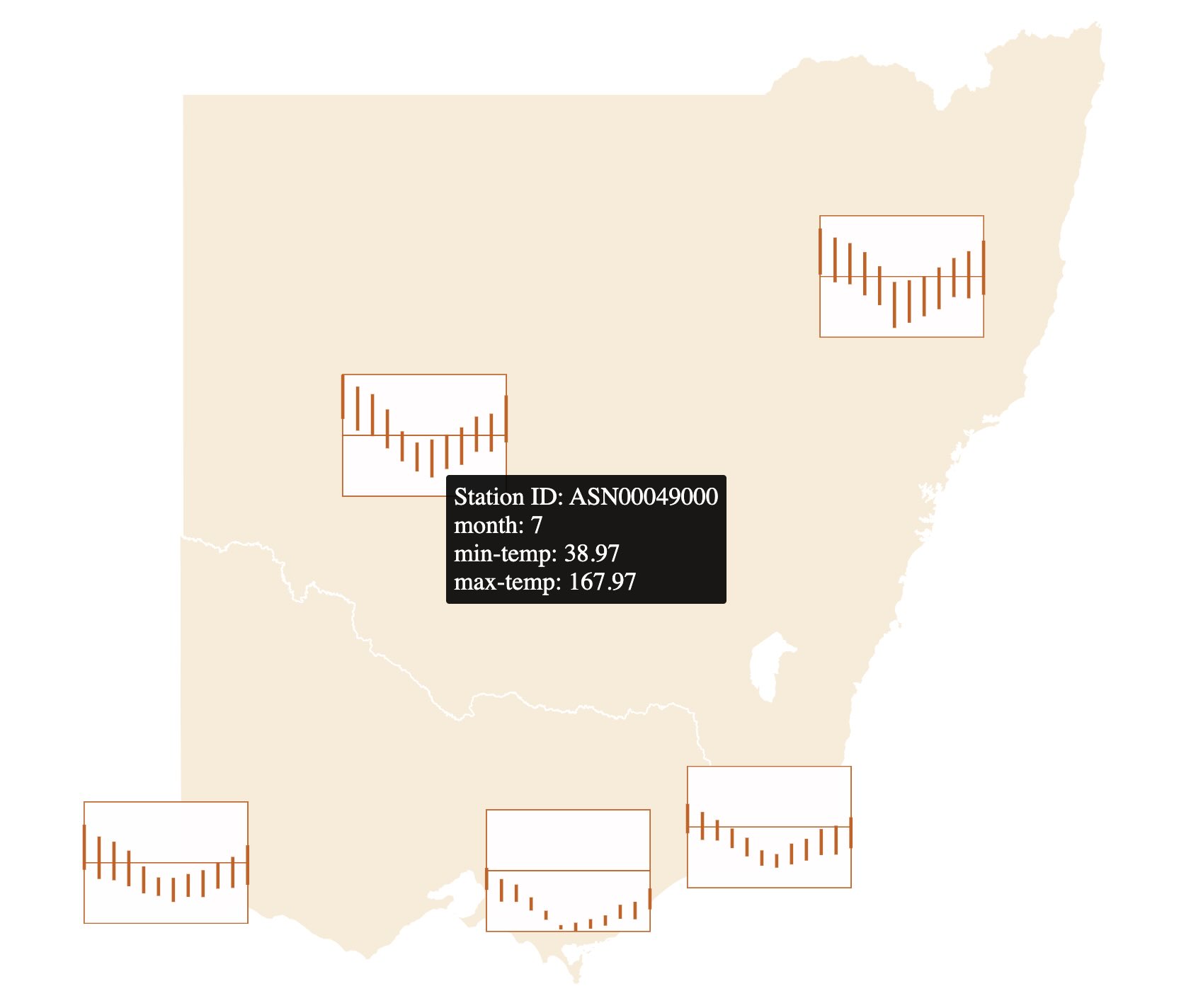
User can generate interactive glyphs with
ggiraph::girafe using sugarglider. To illustrate, we will
use the aus_temp dataset in this example. First, users need
to specify tooltips, which are the details displayed when hovering over
the glyphs. In this example, the tooltips consist of station id, month,
minimum and maximum temperature across all month.
vic_nsw <- aus_temp |>
  filter(id %in% c("ASN00026021", "ASN00085291", "ASN00084143",
                   "ASN00055325", "ASN00049000"))
# Specify tooltip for ggiraph
vic_nsw <- vic_nsw |>
  mutate(tooltip = paste("Station ID: ", id,
                         "\nmonth: ", month,
                         "\nmin-temp: ", round(tmin,2),
                         "\nmax-temp: ", round(tmax,2)))
Tooltips needs to be provided in the asethetic to in the
tooltip argument. User can then plot their desired glyph
map and save it as a ggplot object. This ggplot object is then converted
into girafe object using the girafe() function.
temp <- vic_nsw |>
  ggplot(aes(x_major = long, y_major = lat,
             x_minor = month, y_minor = tmin,
             yend_minor = tmax,
             tooltip = tooltip)) +
  geom_sf(data = abs_ste |> filter(NAME %in% c("New South Wales", "Victoria")),
          color = "white",
          fill = "antiquewhite", inherit.aes = FALSE) +
  add_glyph_boxes(color = "#CD5C08") +
  add_ref_lines(color = "#CD5C08") +
  geom_glyph_segment(color = "#CD5C08") +
  coord_sf(xlim = c(140,153)) +
  theme_glyph()
# Interactive plot using ggiraph
girafe(ggobj = temp)